
The Crackle Corn brand is one of our personal favorites. We always say we are only as good as our clients. Crackle corn creator Katherine Yerondais is definitely a client we enjoyed working with. Katherine is a Melbourne based pastry chef whose commitment for perfection has resulted in the creation of a Caramel Popcorn Treat that refuses to compromise. Handcrafted in small batches with all natural ingredients, this modern take on an old classic makes Crackle Caramel Popcorn a go-to snack. We found our inspiration for the crackle brand in the Artist Carmen Herrera.
Carmen is an abstract, minimalist painter still living, creating and exhibiting in NYC at the age of 102. Although Carmen has been painting all of her life, she was only discovered at the age of 89. She held her first major exhibition aged 94 years. Based on this Herrera’s paintings were the inspirations behind the graphics supporting the crackle corn brand.
Branding
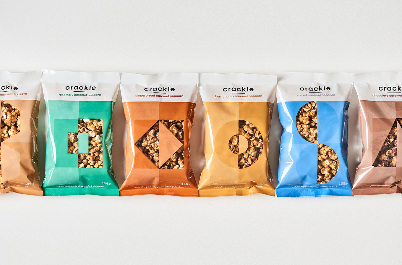
Packaging
The packaging for each of the popcorn flavours was based on a graphic inspired by Herrera’s abstract geometrical paintings. We chose a beautiful subtle palette to further distinguish each flavour. Our chosen colours are reminiscent of flavours like honey, salt and caramel. Leading to a package design, that is easily recognized making it easy to remember each flavour. Our crackle popcorn design really stands out on the shelf. This is due to his original monochromatic design. Our Crackle popcorn bags are an example of the fact that FMCG products can be bold and beautiful.

Web Design
Crackle’s website is an e-commerce platform designed for the brand. Furthermore the website is a true expression of the brand. Our design uses the brand colours mustard and blue throughout the design. Our teams approach was an easy to navigate website design that is reminiscent of the crackle brand and full of flavour.
Stationary
The stationary was created based on the brands pillars of using colour and form. All printed communications as business cards, stationary and flyers use this brand language. Leading to a recognisable and fun brand approach.
